Segment: From a Student Project to an Open-Source Font
Some projects begin as carefully planned ideas. Others start almost by accident, during a moment of frustration, curiosity, and experimentation.
The font initially then-named Split, belongs to the second group.
The story started exactly ten years ago, during my graphic design studies and a Typography class assignment. The task was to create a font from scratch. Not a fully professional typeface with perfect spacing, kerning, and all the invisible details that make a font truly polished, but an exercise in creativity, observation, consistency, and learning how to work more precisely in Illustrator.
The first font I created for that assignment was called Chinese Teardrop.
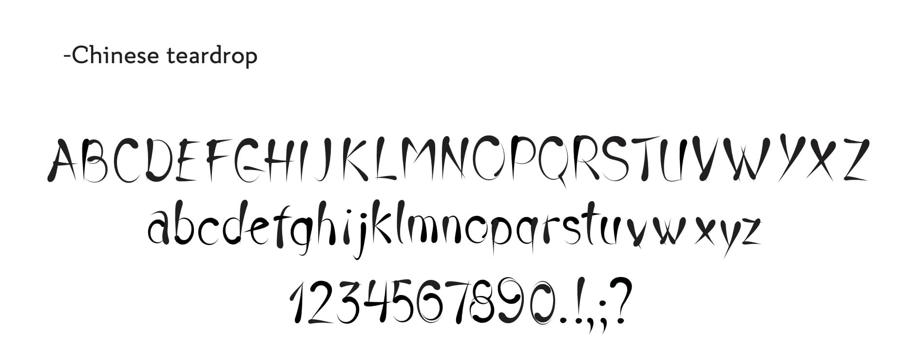
It was inspired by calligraphy, handwritten serif letters, and the kind of decorative writing that had always been part of my visual world. Since childhood, I enjoyed practicing beautiful handwriting, creating titles on big sheets of paper, and making school projects look more carefully designed. That interest naturally led me toward a more elegant, decorative, and complicated font style.
Chinese Teardrop was a good starting point because I wanted to recreate the effect of ink when writing handwritten letters. When you write with ink, some parts of the stroke become thicker, while others slowly become thinner. I wanted the font to have that same feeling: a line that changes, breathes, and carries a handmade quality.
The main visual motive of the font came from a simple circle, which I transformed into a teardrop shape. That teardrop became the base element that gave the font its character and connected the letters visually.
Of course, Chinese Teardrop was far from perfect. At the time, I did not have the knowledge, experience, or time to create a fully polished handwritten font. But I wanted to make something unique, something that felt different from the usual student exercises and carried a recognizable visual idea. Looking back, I can see many flaws in it, but I am still proud of the work I put into it, especially the use of the Pen Tool in Illustrator.
It was a detailed and demanding process, especially for a beginner. The letter S was definitely the most difficult one. As our mentors had warned us, it was one of the hardest letters to get right, and I spent around two hours working on that letter alone.
At some point, after a lot of time spent with the Pen Tool and a lot of frustration, I needed a break.
That break became the beginning of something completely different.
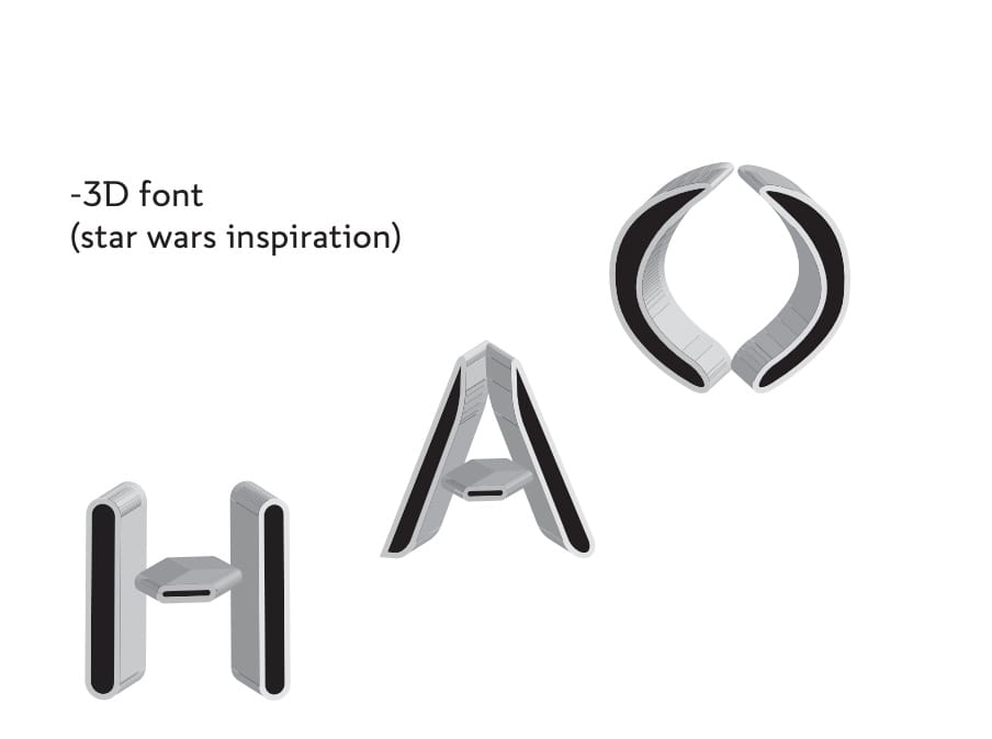
While experimenting with Photoshop’s 3D tools and trying out different shapes, I started thinking about letters again. I created a few forms that felt sharp, futuristic, and unexpected. They reminded me of Star Wars, even though that aesthetic was not really part of my usual interests at the time.
Back in Illustrator, I decided to try a technically simpler direction. Instead of curves, serifs, and delicate handwritten details, I started drawing lines, rectangles, and geometric forms. I added a small rectangle to each letter as a visual detail. The letters became sharp, cut, and split in half.
That is how Segment started.
Although it looked very different from my usual style, there was something strangely familiar in it. The font reminded me of the way my mother taught me to write titles in elementary school: tall letters with a narrow structure. That small visual memory from childhood came back naturally while drawing the letters, making the font feel personal even though its style was more technical and futuristic.
Compared to Chinese Teardrop, Segment was created very quickly. With Vikings playing in the background, the main letters were finished in around two hours. The next day, the work continued on Chinese Teardrop, while Split stayed unfinished, with only the letters completed and the numbers left for another time.
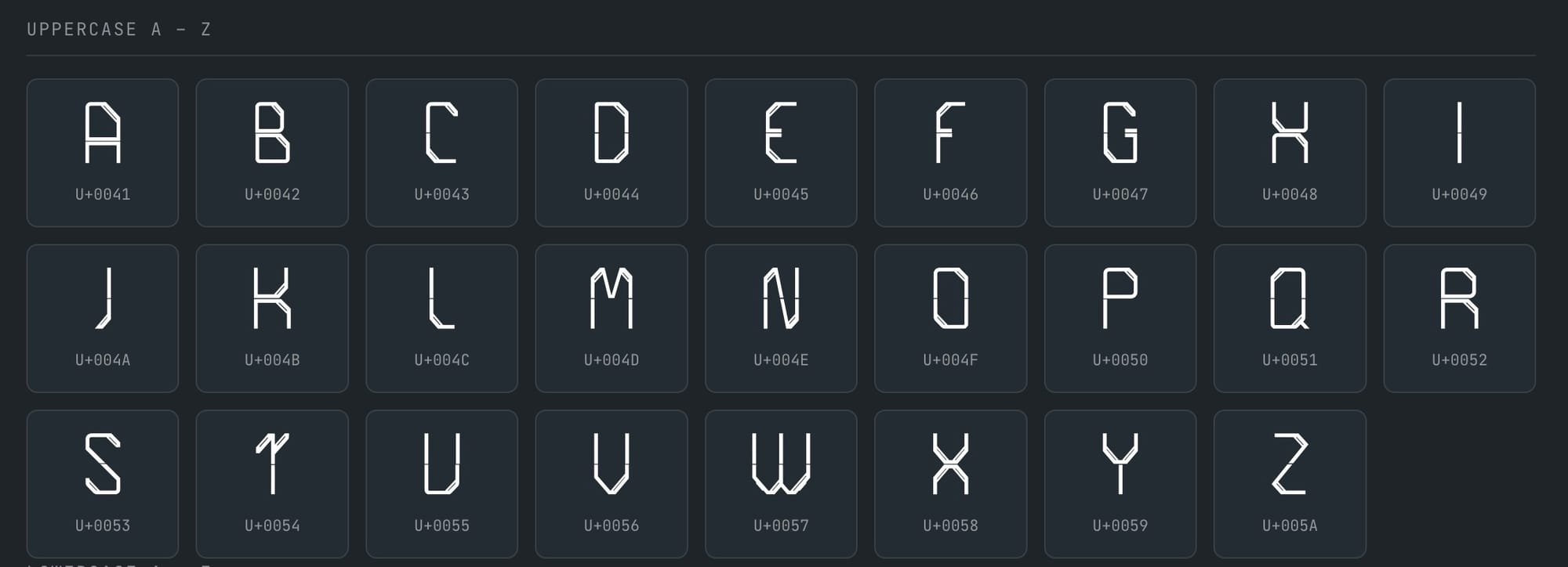
At the time, I did not think too much about it. I was simply happy that in a short period, I had explored two completely different typefaces: one elegant, decorative, and inspired by calligraphy, and one sharp, geometric, and futuristic.
Years passed.
Computers changed, jobs changed, and the font remained somewhere in an old folder, almost forgotten.
Then Base42 happened.
During the process of creating the visual identity for Base42, the inspiration came from hackerspaces around the world: their websites, logos, communities, and the visual language around them. That was when Split came back to mind. A font created years earlier, almost accidentally, suddenly felt like it belonged perfectly to the spirit of the space.
There was only one problem: the file was stored on an old laptop that was no longer usable. The laptop case was broken, and repairing it made no sense. In a very hackerspace-like moment, another laptop was found, the old hard drive was placed inside it, and the search for the Split files began.
After an entire Sunday afternoon of searching, the file was finally found.
I opened it again after all those years, finished the numbers 4 and 2, and the Base42 logo was ready.
Three years later, Base42 had grown into a lively community space filled with meetups, workshops, conferences, collaborations, experiments, and people building things together. The font, too, started growing beyond its original student-project form.
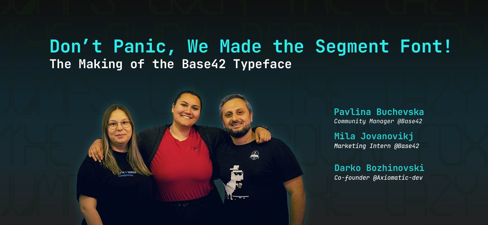
Many of you know Dare from the BeerJS community or have seen him at Base42, where he is often involved in different projects and activities. He helped turn Split into a real, usable font and finally gave it the form it had been missing for years. Mila Jovanović, an architecture student who recently joined the Base42 team, continued the work and finished the numbers and s icons. Ilija created the website for the Base42 font, giving it a proper home and making it easier for people to discover and use it.
A big thank you goes to everyone who invested their time, knowledge, and energy into making this font a reality. Split may have started as a student project, but it became an open-source font because people helped shape it, finish it, and bring it to life.
Like everything in Base42, the font is made to be shared. Anyone can use it, modify it, improve it, learn from it, or build something new with it.
Segment started as a break from frustration during a Typography class.
Today, it is part of the visual identity of Base42.
And from now on, Segment belongs to the community.
Let’s take a closer look at the font and how you can get it.
How to get it?
Segment is a display typeface: geometric, tall, narrow, with the small rectangular cut that gives it its name. It is made for headlines, logos, and posters, not for paragraphs of text.
It currently ships 62 glyphs in one weight: A to Z, a to z, and 0 to 9.
- Try it and see every glyph: 42dotmk.github.io/segment
- Source code: github.com/42dotmk/segment
- Package: @42mk/segment
- Download the font files: latest release
How to get it, for designers
Go to the latest release and download segment.ttf. It is right there on the page, no unzipping needed. (The segment-font-v1.0.2.zip next to it holds every format at once, if you want them all.)
- macOS: double-click segment.ttf, then click Install Font.
- Windows: right-click segment.ttf and choose Install.
- Linux: copy segment.ttf into ~/.local/share/fonts/, then run fc-cache -f.
After that, Segment shows up in your font list like any other font: Illustrator, Photoshop, Affinity, InDesign, Word, Canva desktop.
For Figma, install the .ttf first, then use the Figma desktop app, which reads the fonts on your machine directly. If you work in Figma in the browser, you also need to install the Figma Font Helper, otherwise the browser cannot see your local fonts.
One thing to know before you start: Segment has one weight and no italic. If you press the bold or italic button, your design tool will fake it and the letters will not look the way they were drawn. Set size and letter-spacing instead.
How to get it, for hackers
With npm:
npm install @42mk/segment
@import "@42mk/segment/css";
.title {
 font-family: "Segment", sans-serif;
}
That import brings the @font-face with it, so nothing else is needed. It also gives you a .segment class you can drop straight on an element.
Straight from a CDN, with no install at all:
<link rel="stylesheet"
     href="https://cdn.jsdelivr.net/npm/@42mk/segment/dist/segment.css">
Self-hosted: the release zip has woff2, woff, ttf, and svg plus a ready-made segment.css. Drop the folder in your project, link the CSS, done.
Or build it from the letters yourself:
git clone https://github.com/42dotmk/segment.git
cd segment
npm install
npm run build
npm run demo
How to contribute
The font lives on GitHub as a set of editable SVG letters, one file per character, so contributing does not require font software. Draw a letter, export it as an SVG, name it after its character, and open a pull request. The rest is automated.
The most useful thing anyone could add right now is Cyrillic. Segment covers Latin and digits only, so it cannot set Macedonian yet. Punctuation and diacritics are missing too.
Issues and pull requests: github.com/42dotmk/segment.
Segment is released under the SIL Open Font License 1.1, the standard license for open typefaces. Use it, sell work made with it, change it, and pass it on. Just keep the license with the files and give your modified version a different name.
The next font we hope to make open-source is Chinese Teardrop. And hopefully, this is only the beginning.
We would love to see more people contribute to the open-source community with Macedonian fonts, because the library of fonts that properly support Macedonian is still very small. Every new font, every improvement, and every shared project helps make our language more visible, more usable, and more present in design and technology.